There are a variety of ways one can use spreadsheets in their genealogical research. With this estate partition, the pie chart did not really help me see anything that was not explained in the judge’s report. But there are times when a pie chart can be helpful when created from a partition suit or an estate settlement.
If disbursement amounts only are given (without stating any relationships), a spreadsheet of names and amounts can be used to create pie chart showing relative portions. Sometimes that visualization can cause the researcher to notice things that they did not notice before. After all, that’s the usual purpose of a chart–to cause the viewer to notice something. I have making charts just so I can say “I made a chart.”
Sometimes the pie charts just make for nice illustrations in blog posts, articles, and other written material discussing an estate settlement. The visualization is helpful for some readers and makes the relative portions of each heir easier to see.
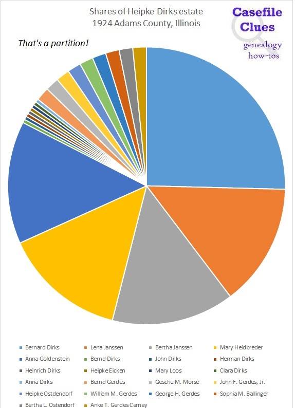
In this case, because there were nine original heirs and some interfamily transfers before the final settlement the relationships are difficult to discern from the pie chart alone. But there are exceptions.
And looks can be deceiving. That blue share for Bernard Dirks looks like it is 1/4 of the circle. It’s not. It’s 16/63–just a little bit more than 1/4.
A picture may be worth 1,000 words, but jumping to conclusions is the cause of 1,000 errors.