 The problem with any organizational tool is that one can always see ways to change it or alter it to meet different needs or to overcome limitations.
Any organizational strategy will have some limitations and often the researcher is only limited by their own creativity. Creativity in this sense does not mean creating data where none exists or creating arguments to support conclusions that are not true. It means thinking about ways to organize all that one has in ways that make previously unknown patterns easier to observe and explain.
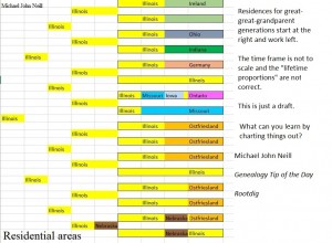
I’ve altered the colorful pedigree chart to include most areas where the most recent generations have lived. There’s no flexibility until my great-grandparents, although I should have put a splash for some color at the end of my maternal grandmother’s life since she lived the last several years of her life in Florida.
In reviewing the chart, I noticed an immediate limitation. The great-great-grandparents, where there is the most flexibility in my situation, would benefit from having some sort of scale running along the bottom of each box. Each box is the same length which suggests they all lived to the same age, which is not true. One might be tempted to also think they lived during the exact same time frame, which is not really true either (the years of birth for my great-great-grandparents ranges from 1835 to 1865). I tried to be “reasonably” proportional with the amount of each color relative to each person’s lifespan (eg. those who lived approximately half their lives in Illinois have boxes that are half yellow).
The entire chart would benefit greatly from having a time scale at the bottom. Then I could also see whose life overlapped whose. I could also see who was living in the same place at the same time as well.
Sometimes all it takes is organizing something once to start seeing other ways to organize things.
Previous charts:

6 Responses
how do we get these charts?
I made mine in Excel, which is what I used to make all of them. I can make a rough template, but everyone would pretty much have to tweak it to fit their own families and migration patterns.
I would like a template.Bit rusty on excel.:)
Would you mind sending me a copy of the rough template, and then tell me HOW to add additional generations?
Thank you so much.
Carolyn
catkinson54@msn.com
You can make your own customized charts by using graph paper, a ruler, and a nice fine-tip pen. There isn’t any universal template for this type of chart. With graph paper, each little box could stand for 5 years.
Michael, it looks like in your chart you don’t care about what dates a person was in each place, only how long she was there? Have you considered making this chart serve dual purposes, by making it a timeline? Then you could look at any given year (say 1910) and, looking down the chart, see where each great grandparent was. Each person’s initial colored box would be determined by his birthdate and place.
Good ideas.
To be honest, this chart was a draft and I never got around to making a more refined version. Having the chart on a “scaled time background” would also be a good idea as this doesn’t give any perspective on which lives overlapped.