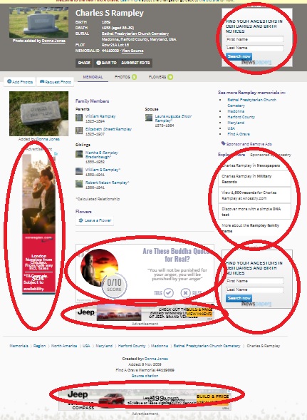
The “new” FindAGrave is still “new.” I took a second look to see if anything was different about the new site.
I don’t think there are any “new” new changes, but I was reminded of a few things about the site that frustrated me.
I understand that websites need to have advertising and affiliate links in an attempt to make money. There are ads on this blog. I understand that completely.
But FindAGrave has gotten a little ad-happy. The new site is seemingly half advertisements and almost looks like an old MySpace Page. Personally there are entirely too many search boxes for Ancestry.com-based databases on the site–two of them are for Newspapers.com. That seems a little excessive for one page.
The new layout makes FindAGrave look like a graveyard for MySpace pages and linkfarms.


3 Responses
I immediately click to see the old site. As long as that is available I will use it. After the option is gone, I will be, too. I no longer add memorials and if anyone wants anything I’ve put there I will give it to them. Ancestry is making money hand over fist on the sites they own. They could have the decency to leave findagrave alone. I have no intention of buying a pizza and a car when I go there. I am totally disgusted.
The old “Find A Grave” had all the information in a nice concise format where you could highlight and print the information on one page of paper (unless there was a long obit ). “New” is not always “better.”
That’s why Adblock exists