Note: I’m beating the dead horse again on color images for those who are new readers to this blog.

There are many documents where grayscale images made at a high resolution are more than adequate for research and analysis purposes. Frequently color isn’t really necessary in order to analyze a document completely.
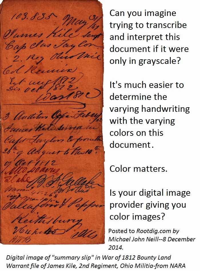
Then there are documents like this which we’re working on for an upcoming issue of Casefile Clues.
Having used a color scan of this document (shown in the illustration), I would not want to analyze it from a grayscale or black and white image. The color makes it much easier to see the at least five (and maybe six) different handwriting styles contained within this document.
Notating on a transcription when one handwriting starts and another one begins is important and can often be done more effectively from color images. My transcription probably won’t include notations about the color (I’m not going to worry about precisely what shade of red “Slade” is written in, but it will include annotations as to what information appears to be in the same hand. Color helps me analyze in situations like this.
And if we read Evidence Explained and the BCG’s Genealogy Standards: Fiftieth Anniversary Edition, isn’t that a lot of what research is about?
Note: Many images at Ancestry.com and FamilySearch were made from microfilmed copies of records that were microfilmed in black and white. In some cases those originals were destroyed and are longer available. My plea for color images is for projects going forward–I’m not suggesting that completed projects be redone.
But I do wonder why color images weren’t made in the first place in some of these cases.

No responses yet