Sometimes I use the “Suggested Records” at Ancestry.com because sometimes some of them are helpful.
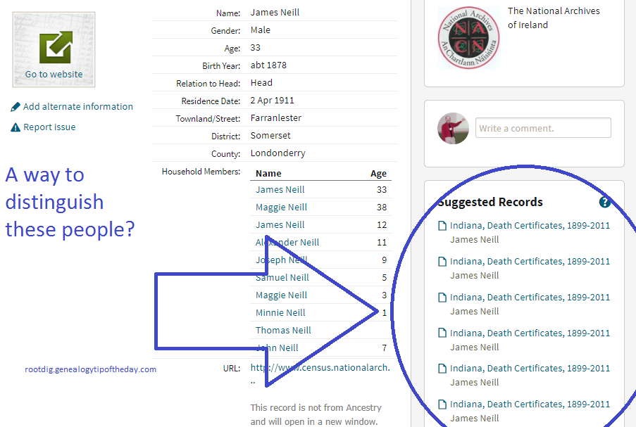
And then there are times like this when the “Suggested Records” are virtually impossible to navigate–like this result for James Neill who was living in Ireland in 1911. There is not enough detail so that I can tell which ones I have looked at–and there are more on the page for this item than shown in the illustration. I have to hope that they sort in the same way on every page where they are shown. I wish I could mark the ones that I had looked at.

I can link records to specific individuals in my tree.
Why can’t I indicate which records I have already seen so that a little mark shows up on the “Suggested Records” list?
Just a little suggestion that would improve my customer experience.

One response
Agree with your suggestion here. I have spent a lot of valuable time clicking and reading these over and over just to discover I have already seen that particular hint. I’ve tried several ways on my own to filter and keep a record of those I’ve already seen but not with much luck from my end. The little ‘ignore’ button also does not suit my needs very well either. I’d love to see anyone else with helpful suggestions here. Thanks